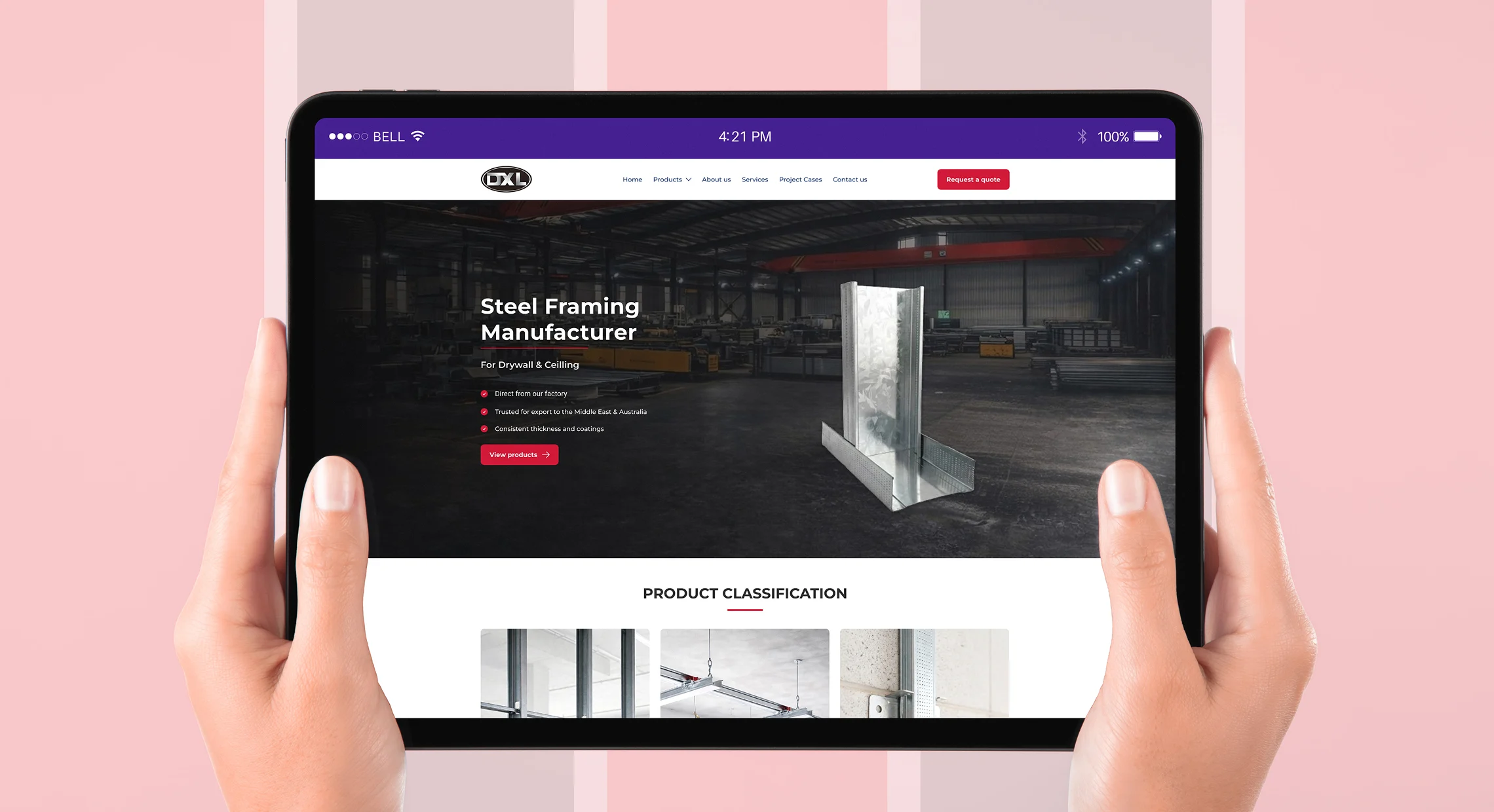
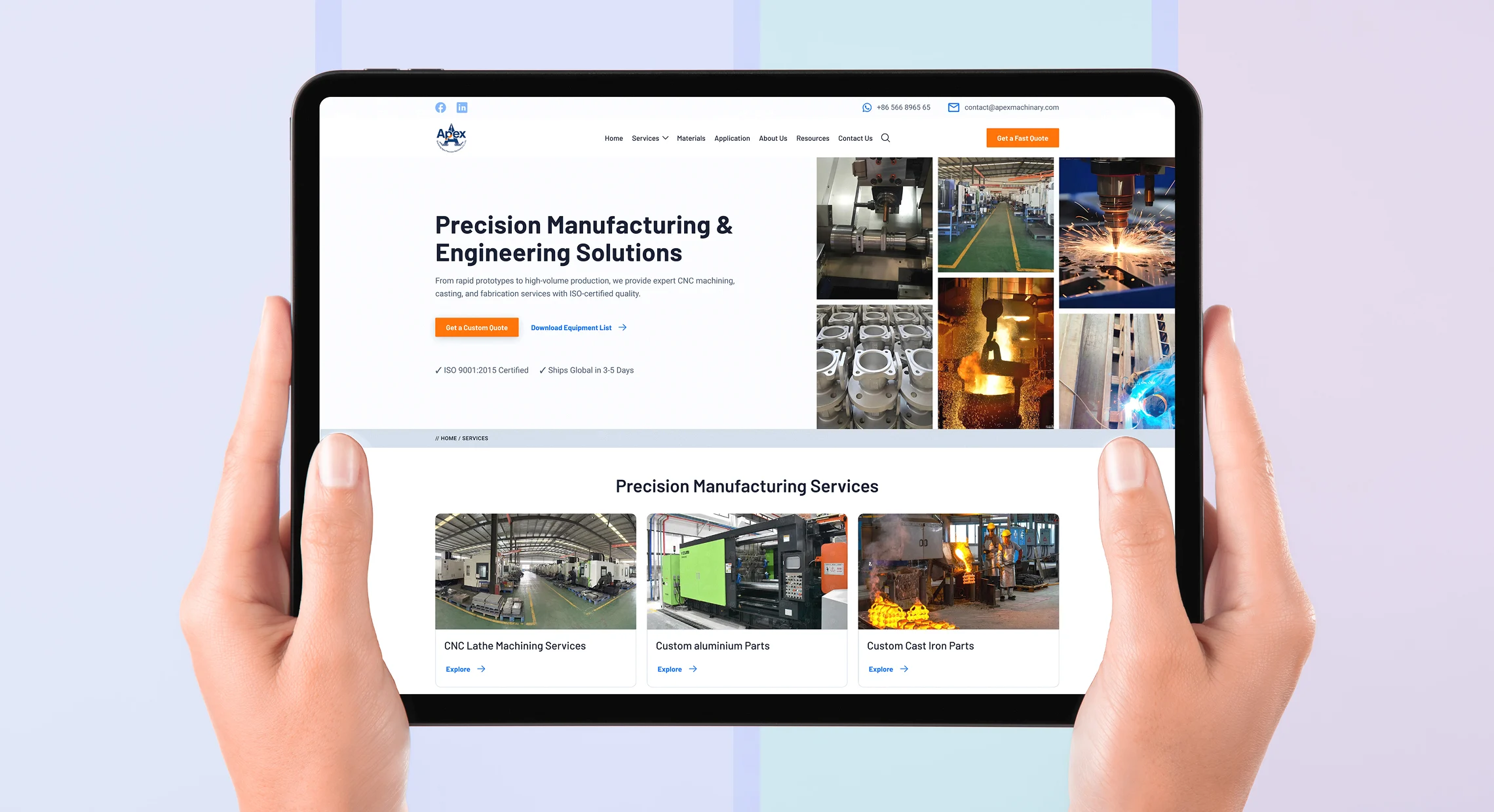
A manufacturing website has one job: help a qualified buyer understand your capabilities, trust your business, and take the next step. Pixerts designs every page around that job — not around portfolios, awards, or aesthetics.
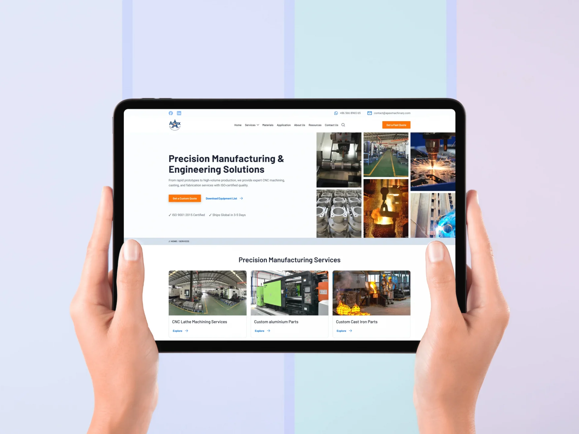
When a procurement officer visits your manufacturing website, they are running a silent mental checklist. Can this supplier make what I need? At what quality? Are they credible? How do I get in touch? They are doing this for every supplier on their shortlist — often on the same afternoon.
If your industrial website design makes any part of that evaluation harder — information buried under vague headings, certifications not displayed prominently, an enquiry form that asks the wrong questions — they move on. Silently. Without telling you why. That lost enquiry never shows up in your analytics. It simply never arrives.
Good B2B manufacturing UX/UI design removes every friction point from that evaluation. It structures information the way buyers think. It builds trust through precision and credibility signals. And it makes the path to submitting an RFQ as short as possible.
Can they actually make what I need? — visible within 5 seconds
ISO? AS9100? IATF? — buried in a PDF nobody finds
Do the specs match what we need?
Have they done this for a company like ours? — no evidence visible
How do I actually start the conversation? — contact form requires 12 fields
Do the specs match what we need?
Every industrial website design project includes all of the following — not as add-ons, but as standard. Because you cannot design a high-converting manufacturing website without all of these working together.
Every page mapped before a single pixel is designed. We structure your industrial website around how procurement officers evaluate suppliers — not around what looks neat in a nav menu.
We define the exact roles who evaluate and submit RFQs — procurement officers, plant managers, engineering leads — and map what each needs to see, in what order, and how quickly before they decide.
Every page, every component, every interaction designed at high fidelity before build begins. You review and approve the complete manufacturing website design — no surprises during development.
Consistent, systematic spacing across every element and every screen size. The grid is not an aesthetic choice — it is a signal of systematic thinking that manufacturing buyers consciously and subconsciously respond to.
Engineered for factory-floor tablets, office desktops, and mobile phones from the start — not retrofitted. Procurement officers review suppliers on mobile. Poor mobile experience loses those evaluations immediately.
Organised for rapid evaluation by procurement officers — specifications, tolerances, materials, certifications, and capacity all structured the way a supplier assessment actually works, not the way a marketing brief reads.
Forms designed to capture exactly what your quoting team needs — right fields, right order, minimum friction. We eliminate the 12-field contact form that drives buyers to competitors and replace it with a structured, low-friction RFQ path.
Certifications, client logos, quality accreditations, and case study proof points positioned where buying decisions are actually made — not buried in an About page that buyers never reach.
Every UX/UI project includes structured data, schema markup, and Answer Engine Optimization from day one, so Google indexes your technical content correctly and AI tools cite your site when procurement teams search for supplier recommendations.
Our industrial UX design methodology is built on three principles that separate a manufacturing website that converts from one that merely exists.
Our industrial UX/UI design work is governed by a set of technical standards that ensure every manufacturing website we build performs consistently across devices, environments, and user types.

Every element — spacing, padding, component sizing, line heights — is derived from multiples of 8 pixels. This creates visual consistency that reads as professional quality at every screen size, from a 27-inch office monitor to a 5-inch phone screen on a production floor.

A humanist sans-serif for body and headings, paired with a monospace font for technical data, labels, and specifications. This combination communicates both human warmth and engineering precision — matching the dual audience of industrial website design: decision-makers and technical evaluators.

Designed at four breakpoints: 1440px (executive desktop), 1024px (office monitor), 768px (tablet on factory floor), and 375px (mobile review). Each layout is specifically composed — not just scaled — so critical information remains immediately visible at every device size.

Every industrial website design we produce is built against Core Web Vitals targets: LCP under 2.5s, CLS under 0.1, FID under 100ms. Page speed is not a developer afterthought — it is a manufacturing UX design decision built into image sizing, font loading, and layout architecture from day one.
Every industrial UX/UI design project we deliver includes industrial SEO and AEO (Answer Engine Optimization) integration from day one. Design and search are one engineered system at Pixerts — not two separate workstreams bolted together after launch.
Your technical content is structured so Google indexes it correctly and AI tools like ChatGPT, Gemini, and Perplexity cite your site when procurement teams query AI engines for manufacturing supplier recommendations.
Every page is assigned a primary keyword target during information architecture — so SEO is built into the structure, not applied after the design is finished.
Product specs, certifications, service areas, and RFQ forms are all marked up with schema so both Google and AI engines can parse and cite your technical data accurately.
Content structured and formatted specifically so ChatGPT, Gemini, and Perplexity cite your manufacturing website as an authority source when buyers ask AI tools for supplier recommendations.
Page speed is designed in — not fixed by a developer after launch. Image weights, font loading strategy, and layout shift prevention are baked into every industrial website design from the start.
We don't just build websites — we engineer digital assets that solve real business problems for manufacturers. Here is what manufacturing website design done properly actually produces.
Stop settling for generalist design. Let’s build a technical interface designed for your specific B2B sales cycle.
A good manufacturing website design surfaces the right information for a procurement officer quickly, demonstrates quality and credibility through design and content, and makes it easy to submit a specific, qualified enquiry. Information architecture matters more than visual style. A well-organised, fast-loading industrial website with clear capabilities content will outperform a visually impressive one with buried information every time. The single most important factor is how fast a buyer can find your core capability and how few steps it takes them to start a conversation.
Industrial UX design is the practice of designing digital interfaces specifically for manufacturing and industrial audiences — procurement officers, plant managers, engineers, and technical buyers. Unlike consumer UX, which optimises for emotional engagement and impulse decisions, industrial UX/UI design must serve buyers who evaluate suppliers methodically: checking specifications, verifying certifications, assessing credibility, and following procurement protocols. The decision cycle is longer, the stakes are higher, and the information requirements are more technical. Pixerts specialises exclusively in this discipline.
Most manufacturing UX/UI design projects run 3–4 weeks — from initial discovery and buyer persona research through wireframing to high-fidelity Figma design and client sign-off. The full project including industrial website development in WordPress typically runs 8 weeks from kickoff to launch. We confirm the timeline at discovery and hold to it throughout the project.
Yes. Every manufacturing website we design is fully responsive from the start — not adapted after the fact. Procurement officers and engineers review suppliers on mobile regularly. A site that performs poorly on a phone loses those evaluations immediately and silently. We design at four specific breakpoints: 1440px, 1024px, 768px (tablet), and 375px (mobile) — each layout specifically composed, not just scaled.
Yes — and this is non-negotiable. Every manufacturing UX/UI design project we deliver includes industrial SEO and AEO integration from day one. Keyword targets are assigned during information architecture. Structured data and schema markup are built into the design system. Answer Engine Optimization formatting is applied to all technical content. A beautifully designed manufacturing website that nobody finds generates zero RFQs — so we build search visibility in from the start.
Project investment varies based on the size and complexity of your site — number of pages, depth of capability sections, RFQ workflow complexity, and integration requirements. We work on projects ranging from focused landing page redesigns to complete multi-hundred-page industrial websites. The best starting point is a free discovery call where we can give you a specific scope and investment figure based on your actual requirements.
A free design audit will show you exactly where your current site is failing procurement officers — and what specific changes would make the biggest difference to your enquiry volume.